
A New Font And Copybooks In The Czech Republic And In Selected Countries Of Europe


Abstract
The contribution presents research on the written script. Specifically, the analysis of the basic materials, which serve as starting material for teaching writing. Since 2013 the Czech Republic joined the new font unrestrained Comenia Script and represent an important new trend in the historical development of the fonts in the Czech Republic, which until now had only a form bound fonts. New unbound font has produced an alternative form since 2015 and has become a new common permitted font. This contribution focused on a new form of unbound font in our country and compares types of written bound font and also unbound font abroad. It follows on an extensive research of Comenia Script font and a research implemented by a help of mixed design, i.e. qualitative and quantitative view of comparison of most copybooks used (exercise books) in the Czech Republic based on evaluation criteria according to Maňák and Knecht (
Keywords: Elementary literacyworkbooksfont Comenia Scrip
Introduction
There are consequences of lifestyle changes, social, communication and technological-informational changes has influenced society, educational environment, forms and also methods of transmission of information and knowledge. With fast development there is also an urge for innovation in the field of obtaining elementary literacy, hence the need for changes of methods, forms and the way of work in teaching reading and writing.
In European countries we work and teach phonic font, which originated from Western Greek font already in the half of 1st millennium B.C. and has been used e.g. for languages all over the world: English language, Spanish, Portuguese, French, German, Italian, Javanese language, Azerbaijani, Latin, Czech, Vietnamese and many others.
The English Latin alphabet was the basis for the font in the Czech Republic, which was adapted to the needs of Czech writing in the 40´s of the 19th century. Only after the reform 1932 the font has a simplified form. The look of this font stays almost the same just only with some minor adjustments up to now.
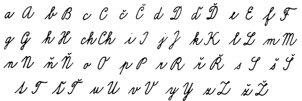
However the qualitative font characters, which draw current copybooks on its base at schools, are outdated and inadequate. We list Czech alphabet of font-bound in its current form for your illustration (Figure
Theoretical basis
There have been foreign research projects, magazines and professional mainly from German, Japan, and the USA or from Scandinavian countries which have been dealing with a research of textbooks. A number of professional texts can be found e.g. in JSTOR, EBSCO, ProQuest 5000 etc. Greber mentions (2006) the existence of special establishments specializing in research on textbooks (e.g. Georg-Eckert-Institute fur internationale Schulbuchforschung, the Norwegian Centre for Pedagogical Texts and Learning Processes, the Australian TREAT – Teaching Resources and Textbook Research Unit at the university of Sydney. Information base for all countries is provided, among others, by IARTEM -International Association for Research on Textbooks and Educational Media (2015, Berlin in FRG). (Košek Bartošová, Plovajková, Podnecká, 2016).
In the Czech Republic, the issues is the domain of the “ Skupina pro výzkum kurikula (Curriculum research group)”, at the Institute of Research for School Education of the Faculty of Education at Masaryk University (IRSE), focusing on the quality and evaluation criteria of textbooks. There is not yet paid great attention in the field of textbooks – copybooks.
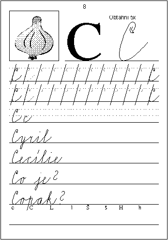
Experts and also general public point out at necessary change of the current font. Particularly the font does not suit to the left-handed (pattern in copybooks with auxiliary lineature of 75 degrees – Figure
Problem Statement
The research intention was to analyse professional material (copybooks) for learning writing in the Czech Republic and in selected countries of Europe. To meet with a new font Comenia Script.
Research Questions
Is it possible to prove dependency between the font itself and introduction of unbounded font in schools? What relation is between own respondents’ font and their attitudes towards unbounded one?
Purpose of the Study
Is to introduce a new form of independent font that becomes to be the second allowed form of the font in the Czech Republic. Further goal is to bring respondents´opinions on implementation of unbound font in schools (to
Research Methods
The research used a non-standardized questionnaire that was spread between respondents by social networks (facebook.com, twiter.com. ...), by email. The questionnaire was statistically processed using MS Excel 2010.
Chi-quadrate independent test was used for contingency table. Pearson´s correlation coefficient was used at some selected questions where correlation was detected.
Pedagogical research since its beginning has naturally applied so called mixed method design – in accordance to research question it combines quantitative and qualitative approaches, methods and techniques of data collection and data analysis (Skutil et al., 2011). Already in 2014 and 2015 we published the analysis of published textbooks, copybooks for reading practice.
Findings
And now we would like to introduce a new unbound font and to summarize some of the professionals’ views, teaches and general public on this certain font type.
New unbound font
Just thanks to the project “Comenia“, when " Comenia Script Package" obtained a prize in a competition Nejkrásnější kniha roku 2008 (The nicest book of the year 2008) and the given project "Comenia" obtained an European award ED AWARD, there was the basis for creation of a new written Latin alphabet font – Comenia Script. (Fig.
Based on two years of verification at 33 selected schools of the Ministry of Education, youth and sports the font has become an alternative to commonly used written alphabet since the year 2012. And in the year 2015 it becomes a common form of permitted font besides bound font. The only condition for teaching unbound font is that pupils have to learn how to read by font-bound by their 3rd class of Primary school. This school year there are three permitted variants of unbound fonts, which differ in only minor variations. Two of them have been listed in an example (Figure
Based on results of our extensive research in years 2010 up to 2014, where 1502 respondents participated, is shown how teacher, experts and general public see the new written Latin alphabet.
From the total results the difference in individual fonts, (thus bound and unbound font) the most beneficial today is binding and fluency in writing of font-bound. Together with that relates also speed and its use. Almost a third of experts perceive lack of poor readability, mainly in connection within European Union.
Interesting fact is that 27 % do not see any insufficiency and concern the current font as satisfactory. New written Latin – unbound font is considered by experts (educators, psychologist, special educators, and handwriting experts) to be preferred from the point of better readability and simplicity and also with the usability for children with severe graphomotor disorders.
As stated by a psychologist and a graphologist Havigerová (2012): “… We might thus deduce that the aim of teaching of written font is that the child is later on able to make notes, record ideas, catch information and inform others. Is it therefore necessary to produce neat handwriting, follow the correct slope or accurately perform punctuation? Or rather learn how to write quickly and legibly if possible?”
Teachers and professionals agree on the fact that the disadvantage of the new font is compliance of gaps during writing between letters and words, furthermore the lack of binding and also little awareness and the survey verification of the new font in practice.
The professional public that has participated in the research aligns with the parents’ and teachers’ view that the unbound font is simpler, less difficult and more uses the chance to write diacritics immediately after a letter. A surprising opinion is that on one side the experts in (27 %) perceive the font as suitable for children with dys failures and on the other side in 50% parents and teachers do not agree with this opinion (Bartošová, Třečková, 2013).
Implementation of unbound font in schools
According to the questionnaire survey (2012 - parents, teachers teaching in unbound font, teachers not teaching this font, general public and experts – 1502 respondents) the parents and teachers who do not teach in bound font tend to incline to the opinion not to implement the new font into schools as the only one possible. From the result there is a certain restrain evident, neutrality or parents’ helplessness, what attitude to choose. The research is based also from the period when the research was implemented, i.e. from the period when verification of font was made unbound (2011) and there were no results and experience known. On the contrary from the interviews with teachers who verified new font in practice, ca 48 % wish that the teaching should spread into schools in the whole Czech Republic.
In detecting correlation of questionnaire parents Pearson´s correlation coefficient was confirmed between own way of writing and the opinion of implementation of unbound font in schools
From the pivot table (Table
Interesting is the fact that findings in the relationship of
Based on a Chi-square test for a pivot table there was also confirmed statistically significant relationship of own font with the attitude toward CS (value
Summary
Unbound font has become a new possibility of the current way of writing. Most of the experts incline to the possibility to implement unbound font in our schools. Parents and also teacher who do not teach the new font are more reserved in their opinion. Also the category of professionals from Educational-Psychological counselling centres still do not know what attention to engage, because they have no experience in the centres with children who had been taught in unbound font (Košek Bartošová, 2014). The Criminal Institute Prague (2015) also deals with the issue of unbond font and published its results on a conference in September 2015.
Font and copybooks in selected countries of Europe
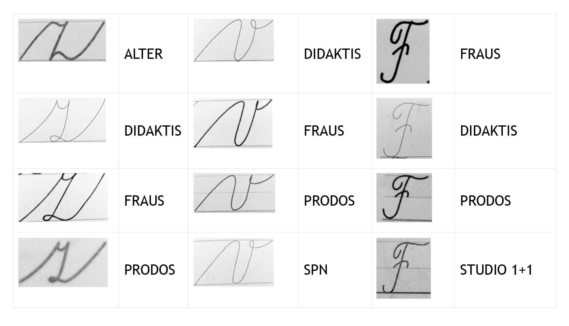
Individual publishing houses involved in publishing workbooks for practice of bound font slightly differ in shapes. All of the letters have been analysed. See a table for an example of a small font z and v and capital F (Figure
Based on research in the year 2014, we obtained information about the most frequently used workbooks of elementary writing in the Czech Republic (participated 614 respondents – 1st grade Primary school teachers). With the greatest predominance, according to our respondents, are the copybooks as well as textbooks by publishing house Nová škola (49 %), Alter (14 %), Fraus (7 %), Studio 1+1 (7 %), Didaktis (6 %), SPN (4 %) and Prodos (3 %). (Košek Bartošová, Plovajová, Podnecká, 2016)
The shape of the letter z by Alter publishing house is based from original teaching of the letter in the last century by Václav Penc. Other publishing houses try to innovate, i.e. shapes’ contraction with sharp font’s features. It is interesting to mention a small letter v, where there is a significant difference in writing the loop at the top snag and also in the letter´s width point. The shape differences is the most noticeable when comparing the letter F at Fraus and Didaktis publishing houses.
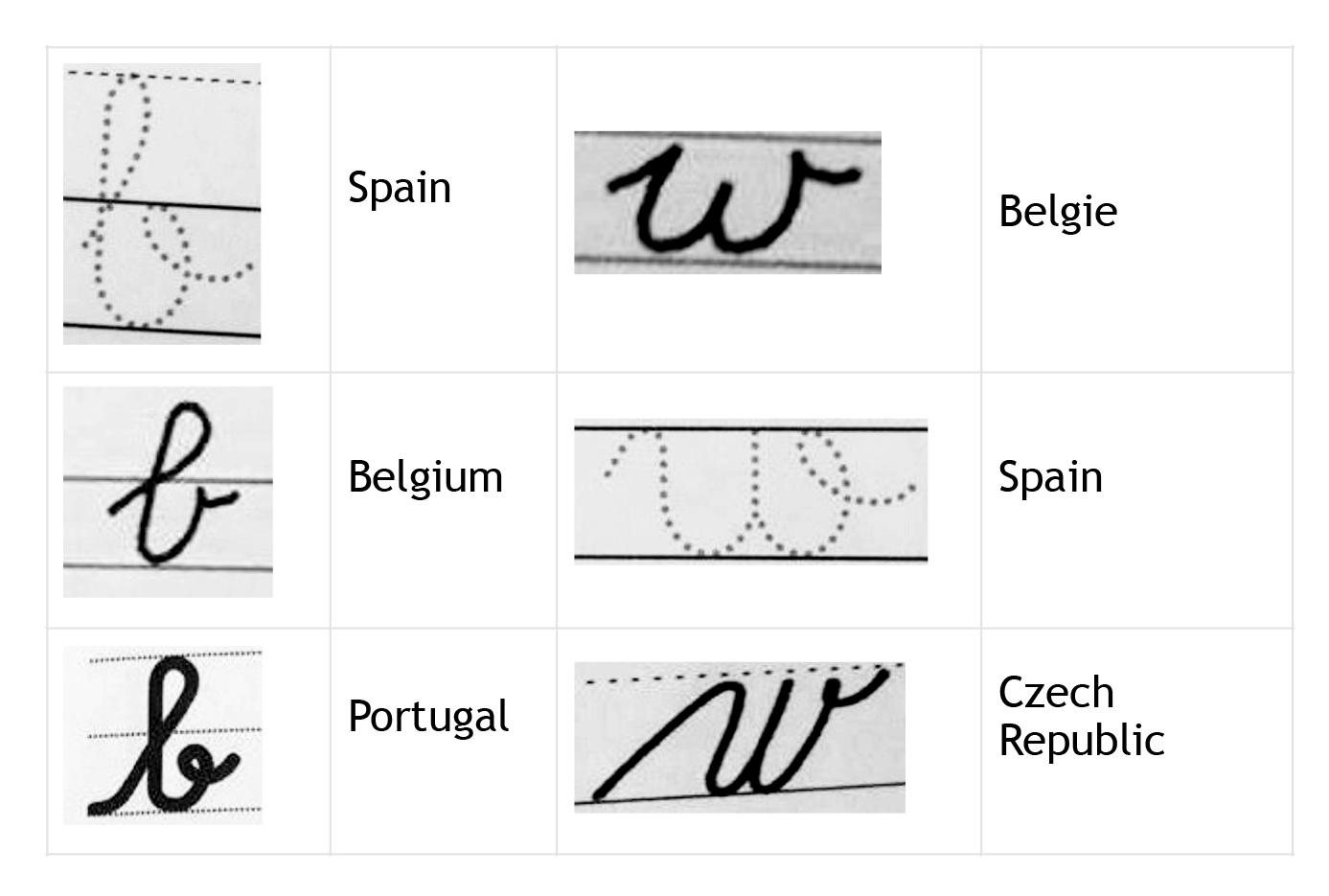
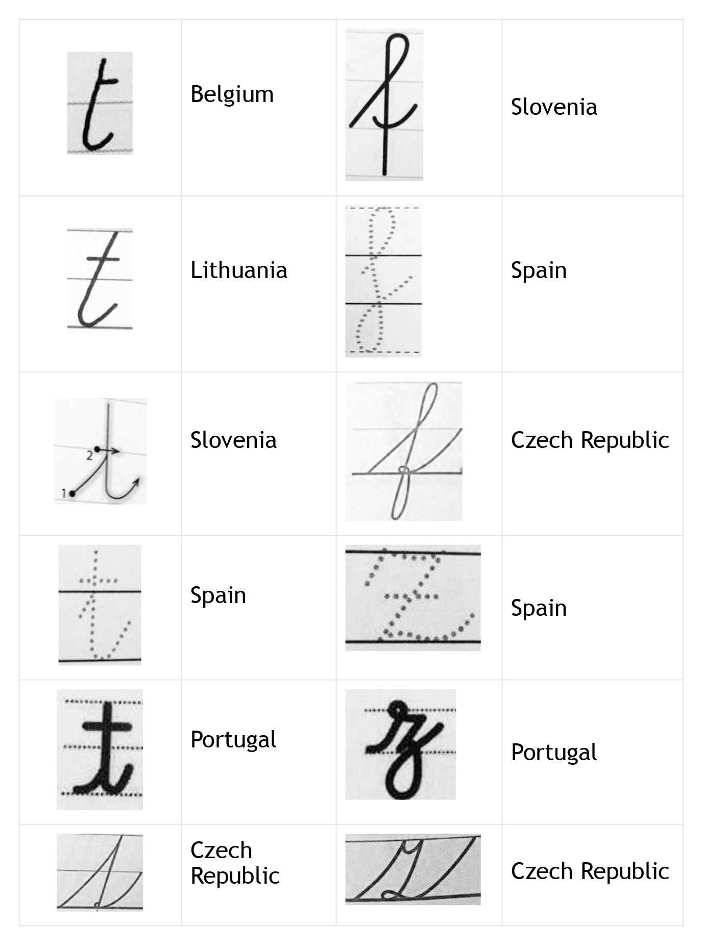
We have been interested what font is used in foreign material. We have seen the samples of at least one copybook from countries: Belgium, Great Britain, Spain, Portugal, Slovenia, Bulgaria and Lithuania. Other material is a part of the study, copybooks from different parts of the world.
According to the range of the contribution it is not possible to process the whole research, but just to bring the font closer by concrete samples from some of the states. The selected monitored indicators represented: both the copybook format, illustrations used, types of exercises (copy, transcript),the font type (bound, unbound) and its qualitative features – letter shape, size, slope, binding and a way of practice (a sample of the letter in a big format, practice with the help of decomposition of the letter in parts, auxiliary lineature).
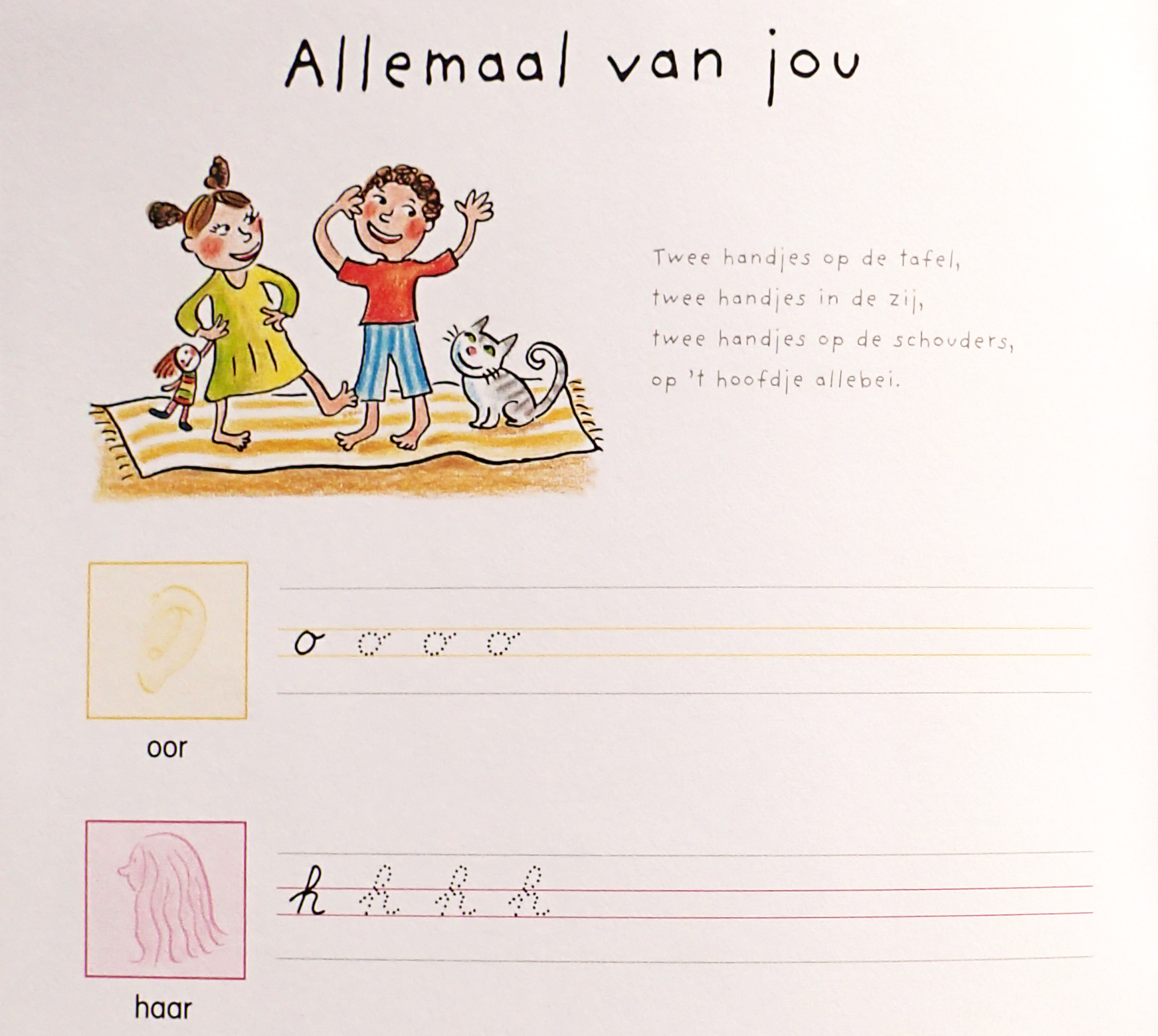
The researched copybooks are in A4 format, just only the copybook from Lithuania and Belgium is close to A5 format. There are illustrations in all copybooks. The Belgian copybook is interesting in the fact that individual double pages are focused on a certain topic – a human body, toys, weather, fruits …(Figure
All of the listed copybooks provide sufficient training of bounded font (Bulgarian font uses Cyrillic alphabet). In Great Britain as well as in the Czech Republic the font type is a subject of discussions (bound and unbound font). In an analysed English copybook pupils learn to write in a font that is similar to our printing font. They connect the font (bound), but some letters do not bound with other following letters, these are:
The publishing house Klett in Slovenia teaches writing in print font in one of the copybooks – unbound font and in the second copybook in bound font. Also in Portugal they have the practice divided, on vowel in one copybook and the second one on consonants (they all write in bound font). They combine writing practice with a grammar page of practicing the language.
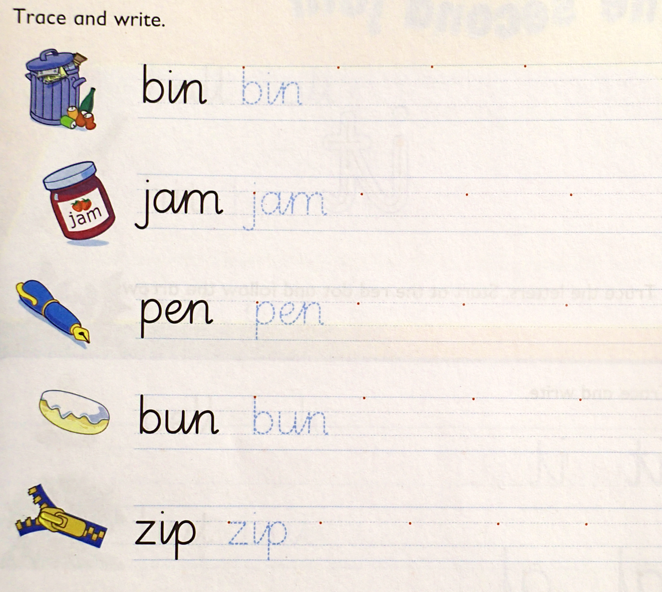
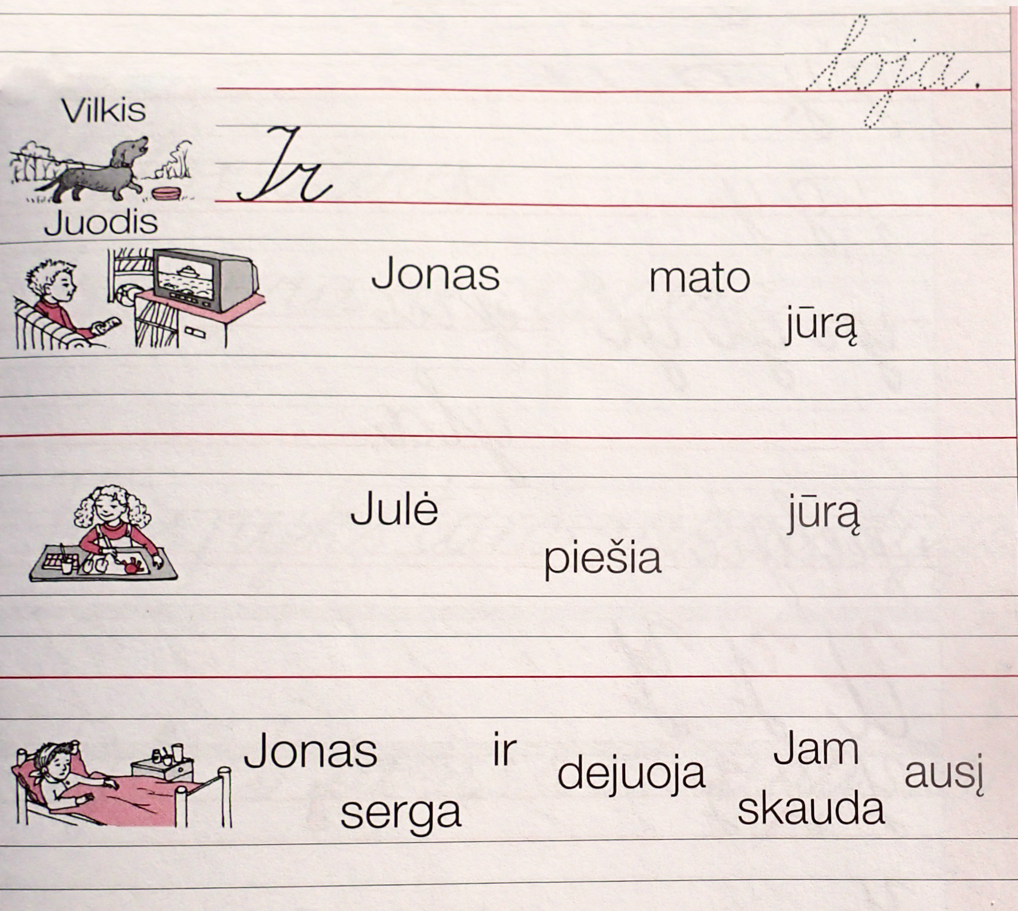
Copy most often occurs in copybooks as well as in Czech so in the Lithuanian and Slovenian copybook we often meet with transcription (transcription from printed version into a written one). (Figure
The practice of slope writing is preferred by our country, Czech Republic, Lithuania, Belgium and Bulgaria. On the contrary in Great Britain, Slovenia and Portugal they teach upright font.
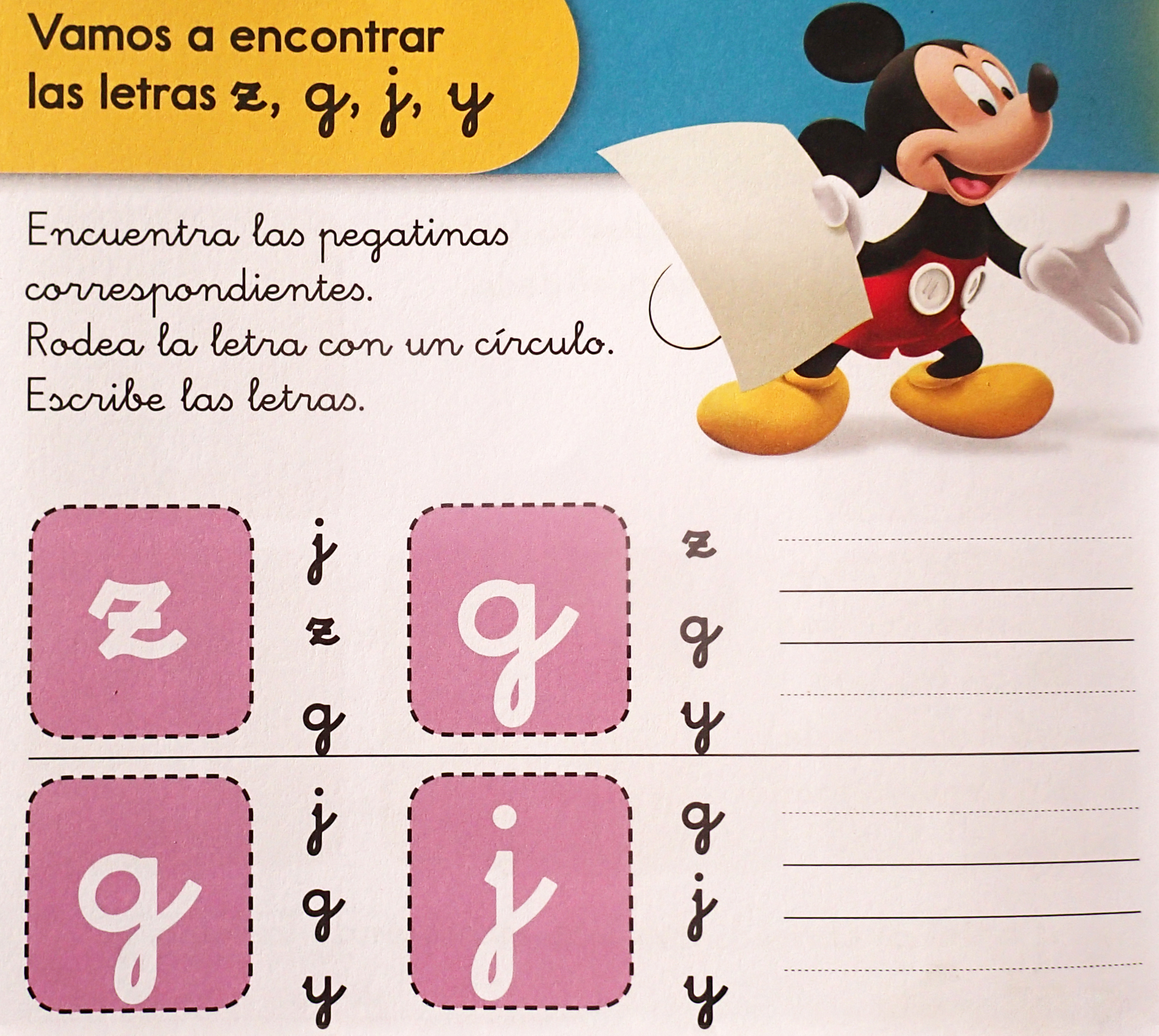
Furthermore we have compared the shapes of individual letters, as are written in the countries listed below. We introduce just for the imagination shapes of some letters without and further analysis (Figure

The practice via auxiliary lineature (lining) can be found in all copybooks. In Belgian copybooks there is no auxiliary lineature at letters with upper length; pupils themselves should estimate how big the letter is. It is also typical that some letters are not being taught to be written directly from the line, but the stroke starts in the middle of the line.
In Slovenian copybook called Lili in bine there are small written letters which are the most similar to written letters which are pupils taught in the Czech Republic. Well of course there are also small exceptions. Almost all of the letters are the pupils taught to write from the line, that is not very common in our country at letters such as
Conclusion
We have just briefly tried to introduce new unbound font and brief results during its implementation in Czech schools. Besides bound font it is possible to teach unbound font since the school year 2015/16. At the same time pupils have to learn how to read bound font.
In the second part of the contribution we introduce with a research focused on comparisons of foreign copybooks. It showed that there are deviations in writing practice, both within one country (e.g. Czech Republic, Great Britain), and of course in comparison with individual countries of Europe. During comparison of copybooks (from England, Belgium, Portugal, Spain, Slovenia, Lithuania and Bulgaria) there are certain significant differences in the way of some letters´ shapes, way of binding, in a slope, furthermore in the copybooks’ format, in illustrations, in auxiliary lineature and in graphic design but also in the way of teaching (using auxiliary lineature, original image of letters etc.). A very pleased finding is that at in investigated copybooks there is not a big difference in the shapes of letters. When talking about the bound font not even the differences in binding letters are not significant.
The most important for pupils is the preparation for own writing of a practicing letter and handwriting, thus development of perceptions, right-left orientation, gross and fine motor skills, graphomotor skills and hygiene habits during writing taking into an account individual peculiarities of a child. A written message should be readable and its practice should be done in happiness and in peaceful atmosphere.
Acknowledgments
This paper presents results of the Specific Research Project of University of Hradec Králové number 2111/2013 and 2112/2015 named: Comparative Analysis of Copybooks (font) used in the Czech Republic and in selected European countries.
References
- Bartošová, Iva, Třečková , Eliška (2013). The professionals' view on the new Comenia script. World Academy of Science, Engineering and Technology, Issue 83, pp. 900-906.
- Greger, David (2006). Přehled výzkumů učebnic v zahraničí. [Overview of the textbook research abroad]. In Maňák, J.; Klapko,D. (eds.). Učebnice pod lupou. Pedagogický výzkum v teorii a praxi. Brno: Paido, pp. 23-32.
- Havigerová, Jana Marie (2012). Pět pohledů na nadání. [Five perspectives on the giftedness] Praha: Grada, p. 91.
- Košek Bartošová, Iva (2014). Elementární gramotnost a písmo Comenia Script. Hradec Králové: Gaudeamus. p. 178.
- Košek Bartšová, Iva, Podnecká, Tereza, POLOVAJKOVÁ, Anna (2016). A Current View of Copybooks (the font) in the Czech Republic and in Selected Countries of Europe. International congress on education (ERPA 2015). Paris: EDP sciences, pp.1-7.
- Kriminální Ústav Praha (2015). Písmoznalci KÚP zkoumají vývoj písma Comenia Script u dětí.
- http://www.policie.cz/clanek/pismoznalci-kup-zkoumaji-vyvoj-pisma-comenia-script-u-deti.aspx
- Lencová, Radana (2011). O písmu Comenia Script [online]. Radana Lencova. [cit. 9. 6. 2011].
- Lencová, Radana (2014). Ukázky písma Comenia Script.[online], Lencova.eu, nestr. [cit. 2. 1. 2014]. Available from: http://www.lencova.eu/cs/gal_ukazky_cs
- Maňák, Josef, Knecht, Petr (2007). Hodnocení učebnic. Brno: Paido, p.141.
- Nakladatelství FRAUS (2014). Ukázka písma font Sassoon. .[online], not paged. [cit. 13. 10. 2015]. https://www.google.cz/?gws_rd=ssl#q=font+Sassoon.
- Skutil, Martin et al. (2011). Základy pedagogicko-psychologického výzkumu pro studenty učitelství. Praha: Portál, p.256. International Maritime Organization (2010). International Convention on Standards of Training, Certification and Watchkeeping for Seafarers, 1978/1995/2010. Please replace this text with References list of your paper (Delete the example).
Copyright information

This work is licensed under a Creative Commons Attribution-NonCommercial-NoDerivatives 4.0 International License.
About this article
Publication Date
16 October 2017
Article Doi
eBook ISBN
978-1-80296-030-3
Publisher
Future Academy
Volume
31
Print ISBN (optional)
-
Edition Number
1st Edition
Pages
1-1026
Subjects
Education, educational psychology, counselling psychology
Cite this article as:
Bartošová, I. K. (2017). A New Font And Copybooks In The Czech Republic And In Selected Countries Of Europe. In Z. Bekirogullari, M. Y. Minas, & R. X. Thambusamy (Eds.), ICEEPSY 2017: Education and Educational Psychology, vol 31. European Proceedings of Social and Behavioural Sciences (pp. 346-355). Future Academy. https://doi.org/10.15405/epsbs.2017.10.32